
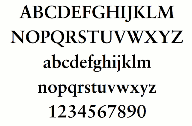
Jan Tschichold (1902–1974) is a person of interest in the world of graphic design. He worked hard perfecting – or searching for perfection – in various project. One of my favorites was his creation of the Sabon type family in 1964.
Tschichold was a typographer, book designer, teacher and writer.
ONE OF THE THINGS I found fascinating about him was his research of ancient books to find how to divide a page in pleasing proportions. He studied the page layout of ancient monks and Gutenberg’s 9×9 layout and eventually demonstrated the geometry and published about his findings.


I then did an experiment to see what the “grid” would be for 8.5 x 11 inch pages. The dimensions are shown below.
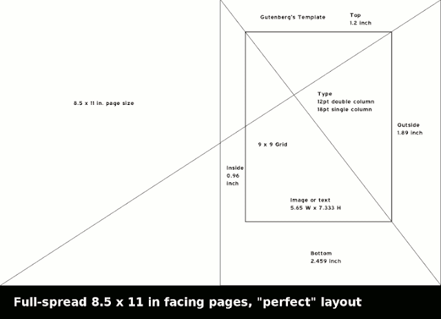

So, you may ask, “What good is this esoteric information for what I’m designing?”
If you are attempting to create a historical theme with a “feeling” of being “old, ancient, or spiritual,” – perhaps even wise – this is a good format. It’s great for storybooks and fairy tales. It may be appropriate for a thematic brochure. The idea is the page layout alone creates a subconscious “reminder” of days gone by. In reality, it’s not “perfect” for every application. But trying it out on your page dimensions can give you new perspective.
