Zero light is black.
In science, black is the absence of light. And color is a phenomenon of light. But a black object or black images printed on white paper are made from pigment, not light. So artists must use their darkest color of paint to approximate black.
What you see as a pigment with a black color or a light with a white color actually contains various light or dark colors. Nothing can be pure white or pure black, except unfiltered sunlight or the depths of a black hole.
Additive color is used in digital design, because computer screens show hues with colored light. Each pixel is composed of three tiny specks of phosphor, which emit red, green, or blue light when struck by an electron beam. When working with color digitally, your screen uses different combinations of these lights to create all the colors you see. So what is black on a screen? No lit phosphors.
White and black may be the most important “colors” in design, as they’re integral to expressing light and shade. First, try working in grayscale (black or white shades only) so you can focus on the shading and composition of your piece.
#000000 vs. Rich Black.
When you convert a file from RGB to CMYK in InDesign, Photoshop, or Illustrator, it will automatically convert pure RBG black (hex code #000000) to rich black, a combination of 60 percent cyan, 40 percent magenta, 40 percent yellow, and 100 percent black. That’s because the right combination of CMYK actually produces a darker-looking black than just 100-percent black ink.
Dark design has an elegant and creative appeal.
In spite of the striking visual impact that these dark designs can have, many designers don’t know how to effectively pull them off without turning off the visitor.
With a dark design comes less readability, less appeal for most readers and less opportunity for conventional design elements.
Light designs are preferred by the general web-going audience by a whopping 47%. The main reason is readability. Most people don’t like viewing light text against a dark background on websites because it strains their eyes, making for a much less enjoyable experience.
By contrast, 10% of those surveyed said that they always preferred dark backgrounds for websites, while another 36% said that the best choice would depend on the type of website.
So, what’s the right answer? When it comes down to it, everyone has their own opinion, and that’s that.
Use More White Space
Or should it be called “black space”? Effective use of white space is important for any type of design, but it is essential for websites with dark backgrounds.
Dark designs have a tendency to feel “heavy”, and cluttering them up can reinforce that feeling. Take a look at some popular dark web designs below, and note their liberal use of white space to great effect.
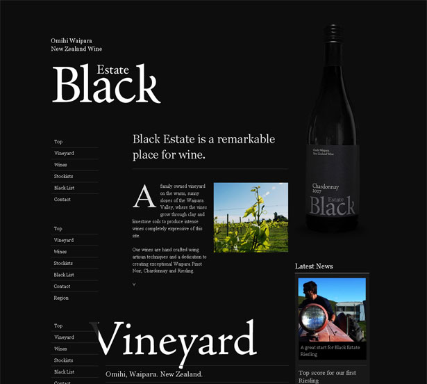
Black Estate is seen all over the Internet in dark web design showcases. It is indeed a beautiful design and worthy of all the attention. A great deal of white space is used throughout the design, and what makes this particular design unique is how the white space is used to outline certain elements so efficiently.
The logo has a lot of white space around it and is the first thing we see as visitors. We see the main content and bottle on the right next. As you see, white space is used perfectly to highlight the text on the bottle and the headline of the main content.

The point here is that white space gradually guides the user down to the end of the page.
The dark background adds depth to the design. Because the website relies so heavily on white space, it would be less interesting without the creative effect of the dark background.
Textual White Space
Because readability is the number one concern of those who dislike dark backgrounds, designers must pay extra close attention to the text itself.
Just as in the overall design, one way to improve readability on dark websites is to increase the white space by adjusting paragraph size, kerning and leading.
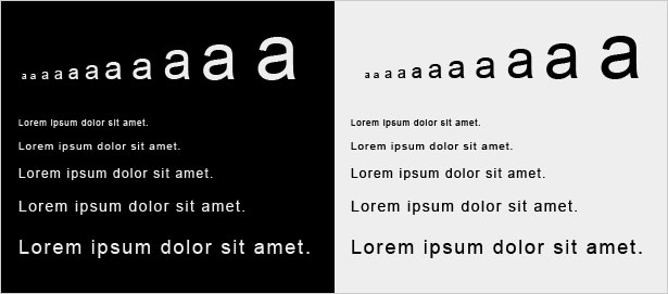
The example below shows what a difference the spacing between and around characters makes in comparing dark and light layouts.

Another way to improve readability in dark web designs is to increase the font size. Like most of the other rules in this post, larger font sizes mean more white space. The bigger the letters are, the more white space will appear around and within each letter.
For example, the letter “a” below gets more white space as it gets larger, both in the area around it and in the space inside the a’s enclosure and under the overhang.
Note how reading small text is so much easier on a light background than on a dark one. When setting the typography for a new website, be sure to look at some dummy text to make sure it is legible. If not, see if increasing the text size helps.

Text Contrast
Many people would agree that the most poorly conceived dark websites cause eye-strain. Too much or too little contrast is usually the culprit. How does one find the perfect balance?
If you are in a room that is pitch black, suddenly looking directly into light is not pleasant. But looking at a less bright light in a less dark room is just fine. The same principle applies to web design.
Finding the perfect contrast means balancing the darkness of the background with the lightness of the text.
Below is a (very) rough guide that shows how contrast between text and background works. One notices that as the background gets lighter, so does the text.
Finding a pleasant contrast for text is much more difficult with a pure black background.
To find the perfect balance, experiment with different shades. The best result is usually a background that isn’t pure black and text that isn’t pure white.

Dealing with Fonts
Fonts plays a big role in design and should definitely be taken into thoughtful consideration with dark layouts. The image below shows a 14 point font on a dark background in both serif and sans-serif fonts.
The sans-serif font is obviously more legible. But many designers still choose serif fonts for their elegance.
The trick, though, is to put only larger text in serif fonts, so that the extra white space floods around each character and makes the text very legible.

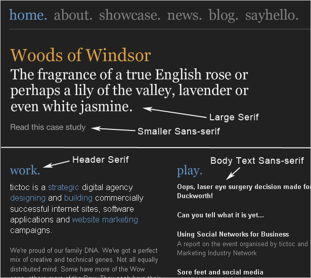
Larger text, (below) such as headlines, navigation and headers, is in a serif font for added elegance. For better contrast and improved readability, the body text is in a clean sans-serif font.

Use Minimal Color Schemes
To give their dark designs a clean and uncluttered look, designers should always opt for minimal color schemes.
From the few examples below, we can see that busy color schemes really get in the way of dark backgrounds, because the contrast is too sharp.
Stick to one or two colors. To add more color, try a dark-colored background.

Granted, many dark web designs have more exciting color schemes. So this rule is often broken, but only with the right techniques.
In general, though, color is often what makes a website look too busy. Because darker websites already have depth, use color with caution.
When Dark Web Design Works Best
Generally speaking, dark works best for creative or elegant designs. For modern sleek websites, dark backgrounds add elegance. For grungy or hand-drawn styles, dark backgrounds enhance the creativity of the layout.
Elegant Dark Design
Dark can be deep, authoritative and strong, and often looks elegant when used appropriately. Here are a few examples and some techniques for bringing out the elegance in a dark design.
This technique can be used for many kinds of websites. Vintage or classic patterns and textures can create a look that is both elegant and age-appropriate.
Most of us associate vintage patterns with high class, so creating a high-class website in this way is easy.
A good process to follow is to add essential content first and then bring in design elements as needed. The designer can then pause and reflect as each new element is added, making sure the layout is not being over-powered.
Just as artwork can appear more valuable in an elegant design, so can products. A dark and sleek design helps showcase the product being sold.
The design reflects the device itself, with its gradients and lighting effects; some designs even mimic the texture of their high-tech products.
Creative Dark Design
Beyond just appearing elegant, dark website designs can also elicit more emotional responses than standard light designs, making them ideal for creative projects. Let’s look at some examples of the kinds of creative designs that are possible.
Dark backgrounds are perfect for websites with very little content.
And because they require more white space, the designer has more room to work with.
Secondly, it has a ton of white space. The background may be textured, but the repeated pattern is seen by the user as white space, helping to lighten the design.
This white space is most apparent to the left of the logo, under the navigation and along the right side.
The white space evens things out, even though it doesn’t look like white space because it has texture. The minimal text and few sections (only three) also contribute to this appearance of simplicity.
Dark backgrounds are often used to make lighting effects and bright colors stand out more.
Such designs are a wonderfully creative exception to the rule of minimal color. But the rule should be broken with caution: avoid distracting gradients, textures and color further down the page.
Dark backgrounds give an elegant and creative feel to web designs, making them perfect for some portfolios, but they’re not suitable for every site.
Black covers a wide range of emotions. It expresses mystery, authority, and elegance, being one of the top choices when designing a website.
black websites
Thomas Rhythm

Another portfolio website, Thomas Rhythm includes multiple elements that make the website refined and elegant. The color black is predominant on the website, but it also has other graphic elements that make it visually appealing.
Void

Void is one of these basic black websites that people enjoy navigating on. It has animations and it tells a visual story, without using any other sort of content other than images and animated content. The page is entirely black, transmitting a sense of mystery. Other dark colors are used to enhance certain elements. The website also has a narrative background.
The Ordinary

The Ordinary has a black and white design, which gives the feeling of a star-filled sky. Behind the website, you can see what a gourmet seafood restaurant has to offer. The website has a nautical theme because seafood is the main attraction at the restaurant.
When is the moment to use a black background
If you are wondering what types of websites are the most suitable for a black background, then here is an extensive list of website types that would look great as black websites
- Websites that present a portfolio
- Websites that present the work of a design studio
- Websites that are meant to present products
- Unconventional websites that are art-related
Tips on how to use a black background for your website
Typography tips
Black websites have to contain readable fonts. Because of the use of a black background, you need to find fonts that work well with the color. White, sharp typefaces are the ones you should stick with. Darker fonts won’t be visible and will require other types of highlighting to be seen.
Reflections are a nice feel
If you feel like the website is too boring without any other elements other than a black background, you should include reflections. Reflections in web design are mostly used when the background is dark or black.
Using images

Make sure to use an image as a background if the theme is too repetitive or common. Using a background image that is dark will have the same visual effect as using a theme that is dark.
You should also pay attention to the way the dark background image blends into the theme’s background. The theme you select should also have darker nuances, so that the image doesn’t just pop-up there.
Selecting a color scheme

Finally, when choosing your color scheme, think about darker nuances that go together, but also think about an accent color that will make elements distinguish better. The color scheme you choose shouldn’t contain a lot of nuances, because black websites are usually minimal and a lot of colors will just make the website crowded and difficult to read.
Power Of Black Color
Black is a powerful color traditionally used to symbolize mystery, power, and elegance.
Many businesses use black to target high-end audience and young generation as customers. One of the reasons for the use of black is that it creates a mystery. It represents elegance and authority as well. If you pair black with any other color, the results are stunning. Especially when black is combined with white, it gives the desired results because of the sharp contrasting effect. There is interplay of light and dark, which some brands want to have in their graphic designs for messaging.
Black evokes strong emotions in people.
Black Engages The Audience
Black is known for reflecting a lot of emotions. These include power, boldness, sophistication, authority, and elegance. If judged on the parameters of visuality, black is categorized as a heavy color. Therefore, it conveys a strong message. Most commonly, black is associated with power and authority.
This is the reason that many high-end brands, which want to project a sophisticated image, use black to convey their dominance in their niche markets. However, in mythical stories, black stands for evil and darkness, and is symbolic of the villain. Some traditions associate black with intelligence and professionalism.
Key Emotions Black Evokes
01. Authority
Have you ever noticed that judges, lawyers and members of the clergy wear black robes? There is a significant reason behind it. They all hold a position of power and authority. That can be reflected by black garments that these powerful people wear when performing their duty. They can instantly convey that they are in a position of authority and reliability.
Those brands which want to be seen in a strong and bold image use black in their marketing materials. Most of the high-end fashion brands have black in their logo design. They want to be seen as a sophisticated fashion brand and want to convey superiority in their target market.
02. Power
Many designers think it fit to use black whenever they need to link a brand to power. Black is an intimidating color that sets a design apart from the others.
03. Mystery
Black is also associated with mystery, which means something hidden and unknown. Many graphic designers use black to symbolize a secret knowledge. It also has something to do with magic and such ideas. These can be hidden feelings.
04. Sophistication
Black is also a favorite color to express class and sophistication. People coming from high societal background often wear black garments on key occasions for this reason.
Brands use black to convey their high-end features and sophistication. Fashion brands use black for this purpose.
05. Elegance
Black is also a color for elegance. Graphic designers use black to give a design some elegant touch and style.
06. Simplicity
Graphic design should be simple so that people can get the message clearly and instantly. For example, if a business card design ideas are simple, they will make a good first impression on the recipient of the card. Black is a simple color. When used in a graphic design, it eliminates the need for other colors, which makes the design much simpler.
07. Modernity
Black carries both tradition and modernity with equal grace. Modern designs are sleek and stylish. Black can express the elegance with the help of clean lines and simplicity of the design.
08. Evil
In graphic design, black can also stand for something evil and villainous. Black can also depict people as anti-social because of stereotypes associated with this color. In other words, if negativity is to be shown in a design, black can do the job easily.
09. Mourning
In some cultures, especially in the west, black is worn on the occasion of mourning someone’s death. So, it is also the color of pain and loss that people experience. Graphic designers can express grief using black.
10. Be Careful When Using Black
A negative point of black is it is an overpowering color. This means that it dominates rest of the elements in a graphic design. The users’ attention is grabbed by black and other colors are simply ignored.
For black backgrounds, increase the kerning, and increasing spacing as well. Also, use larger fonts.
Any other foreground color will stand out if black is in the background because of the separation and dissociation between the two.
11. Should You Use Black For Text?
While black is the color of power and authority, graphic designers are divided on using this color for text. Many designers feel that it can be used for text with some precautions. If proper spacing and kerning is ensured, there is no harm in doing text in black.
Black for text can put more strain on the eyes.
Black is a color of authority and power. But it is also associated with mystery, magic, and some negative things. So, use this color carefully to express your brand image and identity of authority and power.
The Cathedral Effect
Here’s an experiment based on Johann Wolfgang von Goethe‘s color theories of physiological color. There’s speculation complementary color resets the cones in the eye giving a pleasure sensation. Is it true? I don’t know. From our experiment, does it seem more pleasant?


Why build a dark Page?
If the second page is a bright orange yellow, the screen appears to “bloom.” It appears bigger and lighter than the dark leading initial page. Psychologically, this is a primacy effect used for centuries by architects. I call it the Cathedral Tunnel Effect. Cathedrals were deliberately built with a constricted passage or entrance hall that – once you step out of it and into the grand hall – caused an inspiring reaction of awe.
It also works well when switching a second page’s dominant color to a “complementary color.” The effect is based on a physiological phenomenon inside the eye where the cones reverse and pleasure is actually generated in the brain from the visual stimulation. This effect is free.
Trying purple behind the text with blurred edges.
Purple is a complementary color (somewhat) to the yellow on the following page. It then seemed the next page with the former black-text-over-yellow-flower appeared bland or flat. Switching the text color to a purple helped – but not the same purple (#330033) as on the first page. It had to be lighter (#330066). The eye read the dark purple text as black with all that surrounding yellow. This is an optical effect known as “simultaneous contrast.“
https://en.wikipedia.org/wiki/Johann_Wolfgang_von_Goethe
https://en.wikipedia.org/wiki/Theory_of_Colours


Varnish
Varnish is a liquid finish applied via the printing press to seal in and protect the ink on the printed surface. It is available in gloss, matte, and UV, and is usually matched to the coating of the underlying paper. Varnish makes a great cover finish for saddle-stitched products like comic books and magazines.

